
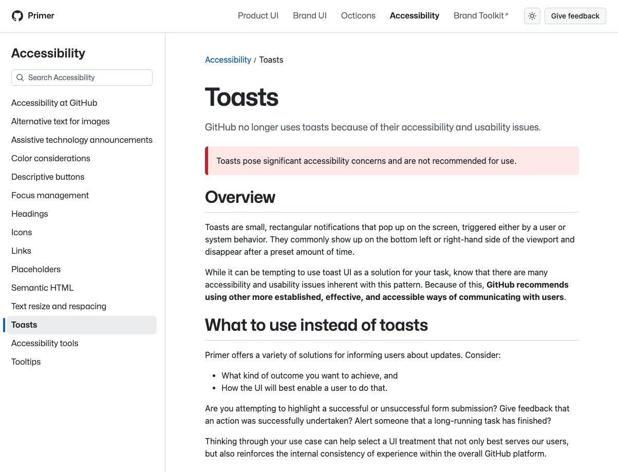
“GitHub no longer uses toasts because of their accessibility and usability issues. Toasts pose significant accessibility concerns and are not recommended for use.
GitHub removed toasts from Primer. They replaced them with inline confirmations and persistent banners. Quiet change. No drama. The pattern is gone.
I don’t use Primer, and I haven’t run accessibility studies on toasts myself, but I dug into the numbers to get a sense of how big this move actually is. The answer is: bigger than it looks.
Why toasts were always a weak pattern
A toast requires perfect attention. It appears in the corner, lives for a few seconds, then disappears. If the user is multitasking, switching tabs, on a large monitor, using assistive tech, or simply not staring at that exact corner, it fails.
Inline feedback doesn’t fail in the same way. It shows up where the action happened. It is persistent. It fits into the flow of the interface.
GitHub choosing inline feedback over floating notifications isn't surprising; it's just the more reliable pattern.
I couldn't find a precise usage count, but a few signals tell the story. From what I can see:
- Primer is the design system behind GitHub.com, which serves over 100 million developers. Every one of them interacts with Primer patterns daily.
- The open source Primer CSS repo has more than 12,800 stars and 1,300 forks (decent numbers).
- Companies like OpenProject publicly documented their adoption of Primer.
- Primer has been actively developed since 2012. It started as an internal Ruby Gem and evolved into a full design system with product UI, brand UI, and a utility-first CSS foundation.
- Accessibility is a major focus for GitHub. An internal audit revealed that almost half of their a11y issues could have been avoided with clearer documentation. That led to them creating the open source Annotation Toolkit for Figma so accessibility gets baked in early.
So yes, Primer is GitHub’s design system, but it also influences a huge amount of external work. When GitHub shifts direction, design teams and engineering teams pay attention.
I find myself nodding a lot to the research findings too.
- Anything that auto dismisses is risky.
- Anything outside the reading order is risky.
- Anything a screen reader might not announce is risky.
- Anything a keyboard user cannot reach is risky.
GitHub's own audit finding, that nearly half of their accessibility issues came from missing or inconsistent documentation, supports the decision too. If a pattern is inherently inconsistent to implement, removing it is a cleaner fix than documenting it better.
What other design systems are doing
While it feels like GitHub's move has come out of nowhere, the vibe has been out for a while now:
Government design systems like GOV.UK, the Australian Government Design System (GOLD), and several Canadian systems like the Ontario Design System never shipped toast components. They default to persistent, inline feedback.
Enterprise systems like Salesforce Lightning discourage toasts for anything important. Toasts aren’t allowed to carry critical messages.
Shopify Polaris includes a toast component but warns heavily against relying on it for anything beyond lightweight feedback.
Material Design still documents snackbars, but Google’s own products now lean more on inline confirmations and banners.
A short history of toast notifications
Toasts started on Android around 2008. They worked on mobile because users were focused, screens were small, and the environment was predictable. One app, one task, one notification.
The web adopted the pattern without the constraints that made it usable. Bigger screens. Multitasking. Keyboard workflows. Assistive tech. Multi-monitor setups. None of that pairs well with a disappearing element in the corner.
The web also never got a native primitive for this. No <toast> element. No standard behaviour. Every implementation is custom, so each is slightly different.
Primer might not be a global standard like Material, but GitHub is a global product. When they stop endorsing a pattern, other teams quietly follow.
What improves when toasts disappear
By removing toasts, we remove:
- missed messages
- time-based failures
- floating UI blocking actions
- inconsistent assistive tech behaviour
- stacked notifications that create noise (different patterns around this, but I think Atlassian handles it best)
Personally, I've always preferred inline confirmation (and more broadly, inline actions in general) and generally get great feedback from users on it. The general rule for me is to make sure interactions and feedback loops happen as close as possible to the trigger. It increases the chance people actually see what they need to see and reduces motion and cognitive load.
Over the years I have gotten used to (and generally don't mind) toast message interactions. So I don’t expect toasts to disappear completely, but I do expect them to lose their default status for product designers and in design systems.
If information matters, do not let it vanish. If you need someone to see it, place it where they already are.
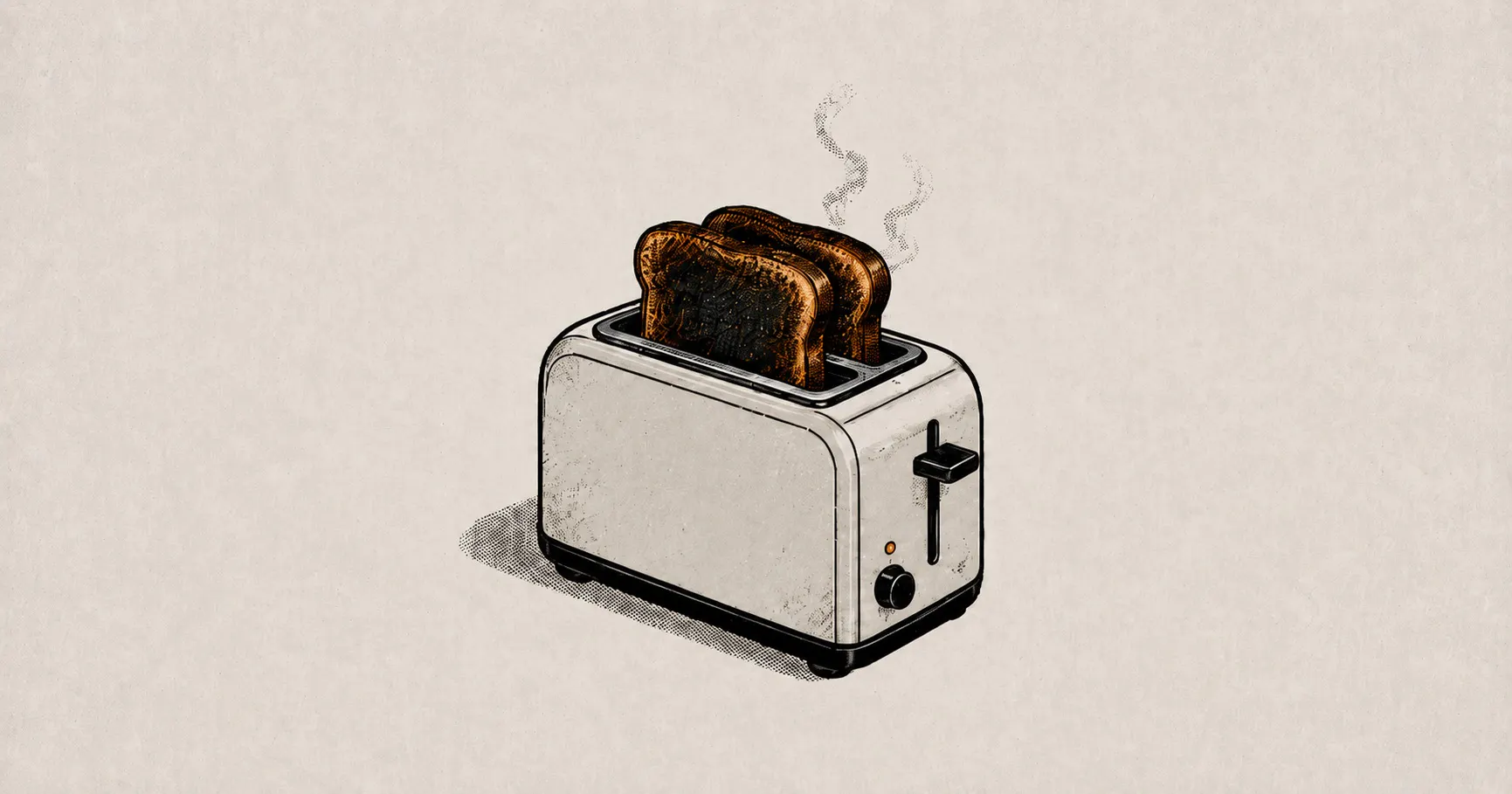
Everything else is burnt toast. 🍞