
You've seen skeleton loaders. Those grey placeholder shapes that pulse while content loads. They're useful, but there's a subtler pattern showing up in well-designed apps that goes a step further. It's one where the interface previews what's coming next before you've even signed in.
I’m calling this the X-Ray Loader.
The problem it solves is specific. In almost every authentication flow, there's a hard cut. You click Sign in and suddenly you're staring at a blank login screen with no cues, no continuity, no reassurance that you're heading somewhere meaningful. The thread between where you were and where you're going gets cut.
A small preview changes that. When the system hints at your destination, even faintly, friction drops and trust rises. It tells the user: "We know why you're here. We're already preparing your space."
Real-world examples
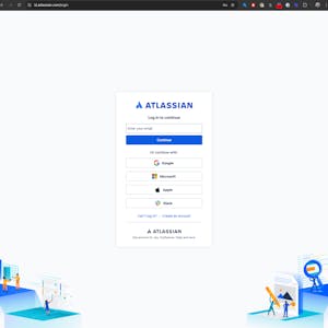
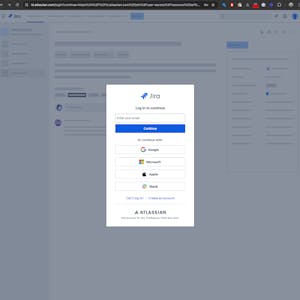
Atlassian
Atlassian captures the referring domain as a URL parameter, which lets the login screen render a subtle preview of the product you're returning to. Coming from Jira? You see Jira's visual language. From Confluence? The login screen reflects that.
The effect is continuity. Rather than feeling like you've been ejected from a product and dumped at a generic gate, the screen feels like an extension of where you just were. That disorienting split second of "wait, am I in the right place?" just disappears.
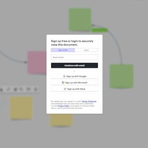
Lucidchart
Lucidchart takes a more literal approach. On their login screen, a faint animated background surfaces the name and sometimes a ghosted thumbnail of the specific document you were trying to open.
It's a small detail, but it does something important. It keeps your goal visible. You're not just logging in. You're logging in to get back to that thing. The reminder of why you started makes the friction of authentication feel shorter than it actually is.
Both are a shift from loaders that pass time, to loaders that preserve intent. That's the distinction worth designing for.
Isn't this just a skeleton loader with branding?
Not quite..
Skeleton loaders hint at layout. They say: something is coming, and it'll roughly look like this. X-Ray Loaders go deeper. They surface the structure of a specific destination, your dashboard, your document, your project - all before you've even authenticated.
I suppose you could call it a pre-contextual loader or a low-fidelity content preview. But naming things is hard, and if it hasn't been done already, I’m coining this the X-Ray Loader because it captures the feeling of the interaction perfectly imho.
Skeletons hint at layout. X-rays reveal the destination structure beneath.
How it works (technically)
The mechanism is simpler than it sounds. The core idea is that the login screen shouldn't be isolated from the rest of the system.
When a user gets bounced to a sign-in flow, most apps send them to /login and leave it there. The X-Ray approach sends them somewhere like:
/login?**from=jira**&**dest=/browse/project-x**No sensitive data. No account IDs. Just lightweight context in the URL: the referring product and the destination path. That's enough for the login screen to prime itself visually before a single character gets typed.
Here's the essential logic:
// Get url params and load xray
const params = new URLSearchParams(window.location.search);
const referrerURL = params.get('from');   // e.g., "jira.atlassian.com"
const destinationPath = params.get('dest'); // e.g., "/browse/project-x"

if (referrerURL) {
  // Use the referrer (Jira/Confluence) to apply product branding.
  const productName = referrerURL.split('.')[0];
  document.body.classList.add(`xray--brand-${productName}`);
}

if (destinationPath) {
  // Use the destination path (settings/dashboard) to load a layout hint.
  const topLevelView = destinationPath.split('/')[1]; // Gets 'browse' from /browse/project-x
  document.body.classList.add(`xray--layout-${topLevelView}`);
}

// Show the combined context overlay
if (referrerURL || destinationPath) {
  showXrayOverlay();
}
The code reads those two parameters and applies the right classes before the user has typed anything. A few lines of logic, and the login screen already feels like part of the product they came from.
Takeaways
- A login screen is a necessary interruption, but it doesn't have to feel like one. Manage this transition correctly, and users will feel like the product was already waiting for them.
- Context is king. Transitional screens shouldn’t be blind to the rest of the system.
- Preserve intent. Keeping a user's goal visible while they authenticate makes the process feel faster too. (They're not waiting, they're on their way vibes)
- Most UX effort goes into the screens users spend time on. The gaps between those screens shape how a product feels just as much. Getting those moments right builds trust in ways that are hard to pin down but easy to notice when they're missing.
X-Ray Loaders are a small act of empathy. Small acts add up. 💪